
Leading a successful team requires more than great products—you need strong operations to keep things running smoothly. This means planning, anticipating bottlenecks, and making strategic decisions on where to focus.
Cumulative flow diagrams (CFDs) support Agile teams by helping monitor workflows, predict disruptions, and increase efficiency. A CFD displays the number of tasks at each stage, from start to finish, allowing you to identify what’s working, where challenges lie, and which tasks to prioritize.
The challenge is reading the diagram. Each color represents different stages, requiring a solid understanding of the Kanban framework and Agile metrics like lead time and work in progress (WIP).
What is a cumulative flow diagram?
Need to give a project update? It can take hours to gather data and explain each task’s status and timeline.
A cumulative flow diagram simplifies this by showing the amount of work at each stage of the process.
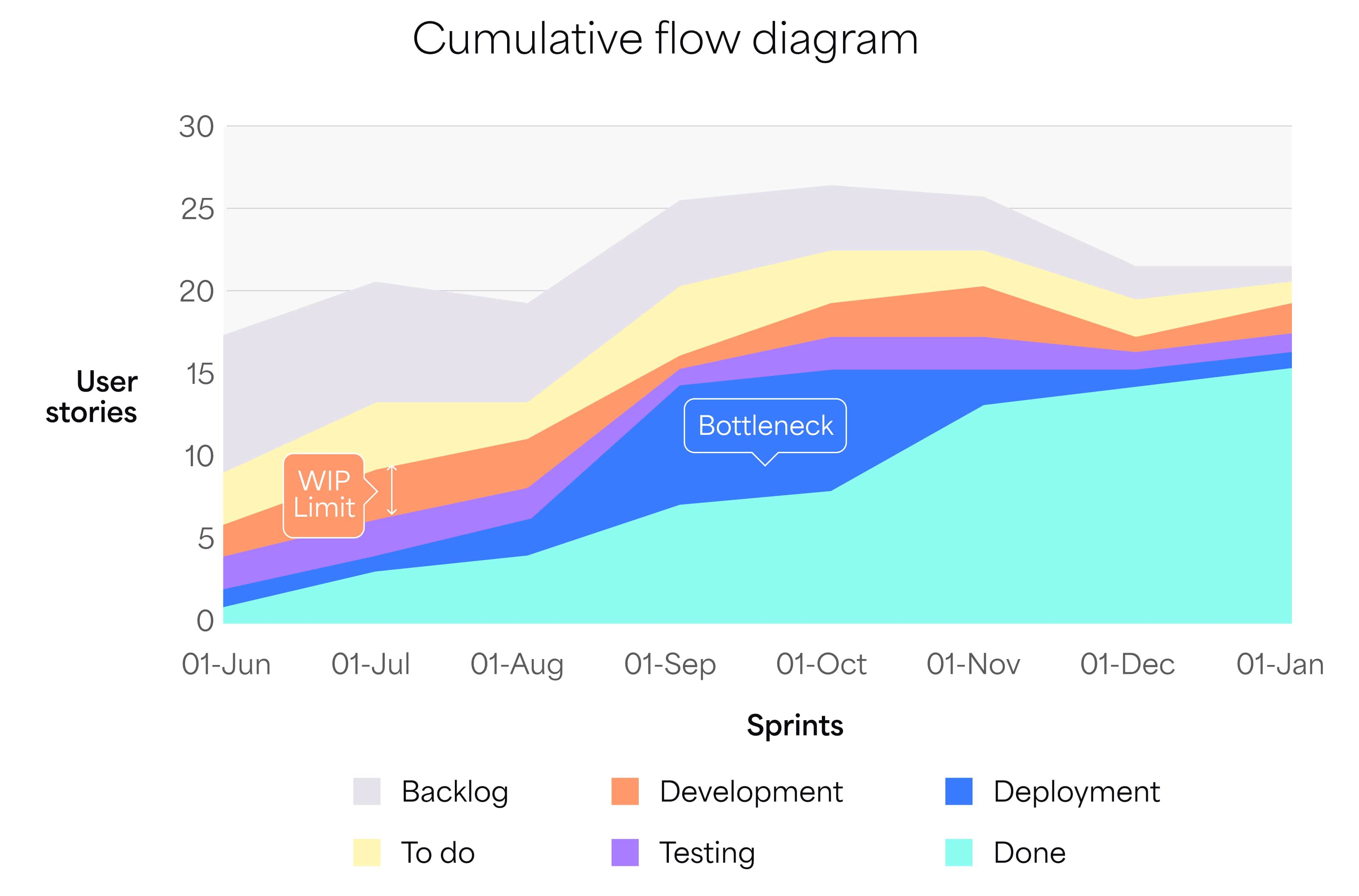
A cumulative flow chart helps identify bottlenecks, inefficiencies, and distractions that slow down progress. Similar to a burn-up chart but with a more granular view, it’s ideal for analyzing workflow dynamics.
This visual overview shows overall project progress, allowing you to track completed work and use the data to boost team productivity.
Where does CFD fit into the kanban method?
CFDs are often paired with Kanban boards to visualize and manage projects.
A Kanban board displays work in progress and tasks needed to complete a project, helping Agile, DevOps, and creative teams improve workflows, stay organized, and reduce waste.
Kanban boards can be physical or digital and usually feature three basic columns:
- To do
- In progress
- Done
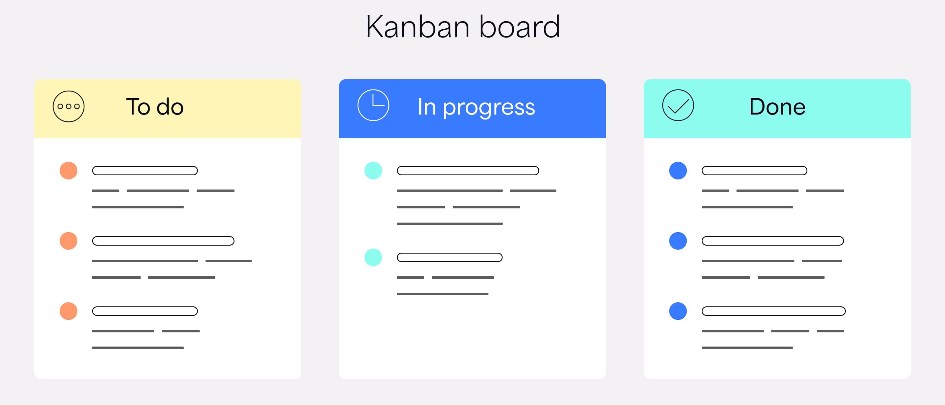
Physical boards use color-coded cards to track tasks across columns, moving cards as the project progresses. Digital boards use virtual cards to represent tasks and assignments.
Cumulative flow charts derive their data from Kanban boards, allowing Agile teams to track work over time, while Kanban boards manage current tasks.
Together, Kanban boards and cumulative flow charts enhance productivity and decision-making, leading to better project outcomes.
How to monitor project progress with CFDs
Choosing the right productivity metrics can be challenging for developers. For instance, Lines of Code (LOC) doesn’t indicate progress—more code doesn’t mean better code or higher productivity.
Instead, use a cumulative flow diagram to track three key metrics:
- Work in progress (WIP): Tasks currently in progress.
- Cycle time: Time needed to complete each task.
- Throughput: Number of tasks completed in a set period.
If your team is missing deadlines, try setting WIP limits to streamline workflow, reduce multitasking, and identify bottlenecks. This approach shifts focus from quantity to quality, helping the team identify barriers to progress.
Throughput helps measure team performance. Tracking it over time shows what’s working well and what needs improvement, helping to set realistic timelines and assign the right people to each job.
In the long run, these metrics lead to better collaboration, higher efficiency, and stronger client relationships.
How to read a cumulative flow diagram
Cumulative flow diagrams use colored bands, two axes, and other elements to track workflow progress. Here’s a breakdown:
- Vertical (y) axis: Shows the number of work items or user stories in the backlog.
- Horizontal (x) axis: A timeline, with the earliest point on the left and the latest on the right, tracking task movement over time.
- Colored bands: Represent workflow stages, such as Not started, Design, Coding, Testing, and Complete.
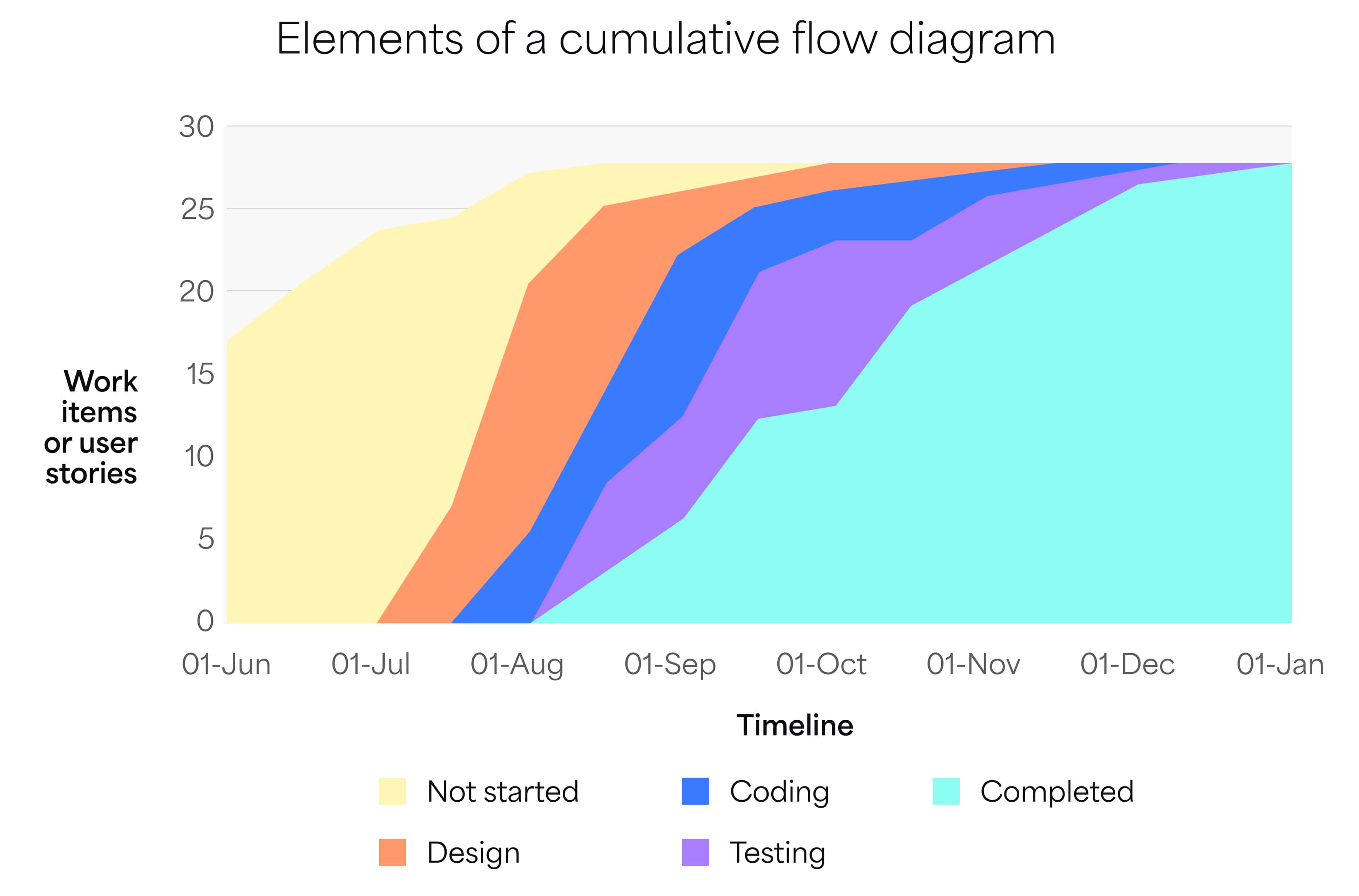
CFDs vary in layout but always include an X-axis, a Y-axis, and color-coded bands. To read a CFD, examine the size of the colored areas over a period, such as a week or six months.
- Parallel bands indicate stable throughput.
- Widening bands suggest incoming tasks exceed completed tasks, pointing to possible bottlenecks or inefficiencies. Complete current tasks before taking on new ones.
- Narrowing bands mean workload imbalances; adjust WIP limits to balance focus.
To measure cycle time, check the horizontal distance between the top and bottom lines, indicating time from start to finish (e.g., “Not started” to “Done”).
What should it look like?
If throughput is stable, the diagram will show a smooth flow from left to right. Color-coded bands will remain fairly even, with the “Completed” band widening over time. Any irregular patterns signal potential issues that need attention.
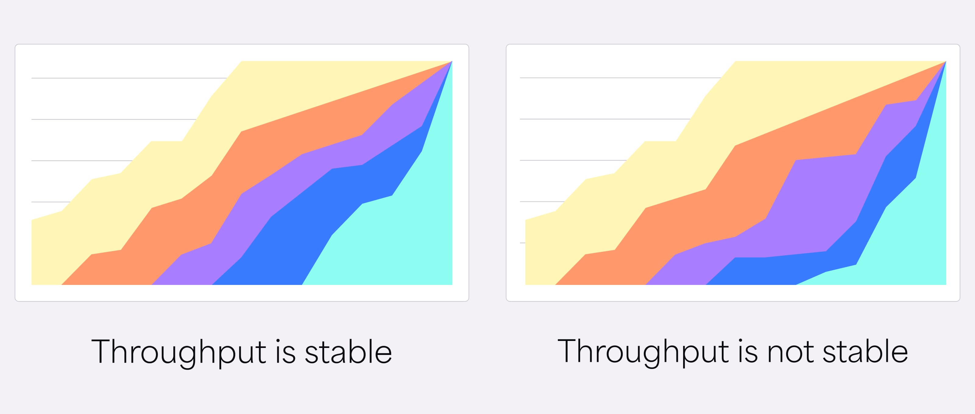
Not all changes in a CFD indicate bottlenecks.
For example, Scrum teams often see rapid curve increases at the end of a sprint, especially when testing before launch. Curves may also flatten during holidays or when staff work on other projects — normal patterns that don’t signal issues.
But if these factors aren’t in play, bottlenecks may be the cause.
How does a cumulative flow diagram differ from other charts?
Cumulative flow diagrams are similar to, but more detailed than, burn-up charts.
Both track project progress, but burn-up charts compare completed work against the total workload. The chart includes a vertical and horizontal axis with two lines: green for completed work and gray for the project backlog. Teams use burn-up charts to track progress toward a goal.
If you need to know how much work is left, use a burndown chart. This tool shows remaining time and helps determine if the team is on schedule. Burndown charts are also useful for measuring sprint progress, velocity, and other Agile KPIs.
While not as detailed as CFDs, burn-up and burndown charts are still valuable tools to integrate into your workflows.
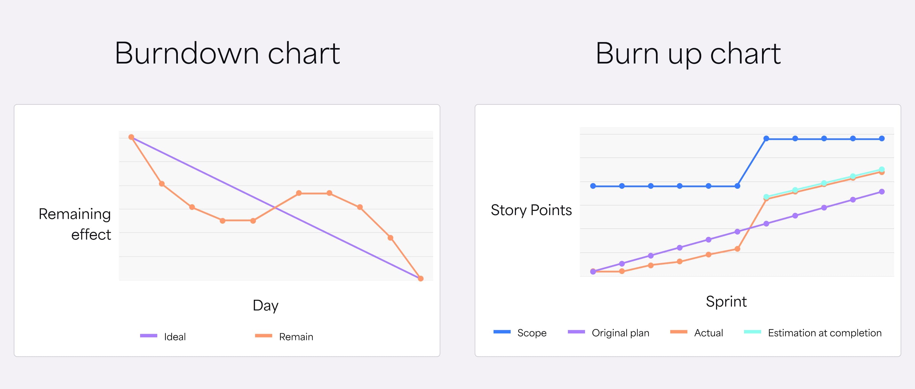
Easier to create and interpret than Agile CFDs, burn-up and burndown charts offer quick insights into project progress and help identify potential issues early on.
Potential limitations and drawbacks
Like other analytical tools, CFDs have limitations and aren’t ideal for every project.
For example, CFDs don’t account for external factors, such as team absences or technical issues, that can impact workflow. You may see increased WIP or lower throughput, but the diagram won’t show the cause, requiring you to check your records.
CFDs also don’t reveal the root cause of bottlenecks, and they assume a steady-state process—less suitable for teams with evolving needs, such as startups. Additionally, CFDs can be complex to interpret in projects with multiple stages or high variability in work items.
Given these limitations, it’s best to use CFDs along with Kanban boards, additional data, and other Agile practices, like sprint retrospectives, for a more comprehensive view.
Measure and maximize developer productivity with the right apps
Cumulative flow diagrams can streamline processes and boost productivity by quickly highlighting bottlenecks and monitoring throughput. But that’s just one chart—Agile projects benefit from multiple metrics and easy, holistic data access.
Dashboard Hub Pro centralizes reporting across Jira and beyond. Create custom Jira charts and consolidate data from Jira, Confluence, and more — all in one place.
You can also combine custom charts into dashboards or use our pre-built templates to track popular metrics. Here’s an example of an Agile dashboard with metrics like velocity, burndown, cycle time, and more:
Developers can use dashboards to gather productivity insights, while managers access visualized data ready for reporting. When your dashboard is set up, quickly share it with stakeholders—password protection keeps sensitive data secure. Continuous Jira integration ensures real-time updates.
Centralize reporting and elevate data visualization with Dashboard Hub Pro. Try it free for 30 days.
Start my free trial